Visualizations that work: Clear, accessible and inclusive
Hey gossip readers, today’s tea is on graphics. By the end of this blog post, you will understand how to create accessible and inclusive graphics using graphic principles. But first, why are these principles important? Not only is it the law to have accessibility in your representations, but it’s also important to be inclusive to people who are colourblind; otherwise, your audience is minimal. Although this sounds like many complicated steps, I’m here to give you examples and help you make your visualizations clear, accessible and inclusive.
Employing graphic design principles for clarity
As gossip lovers, I’m sure you all love it when the information is clear and concise. It’s the same principle with graphics! So let’s start by analyzing my illustration so you can understand from the example!
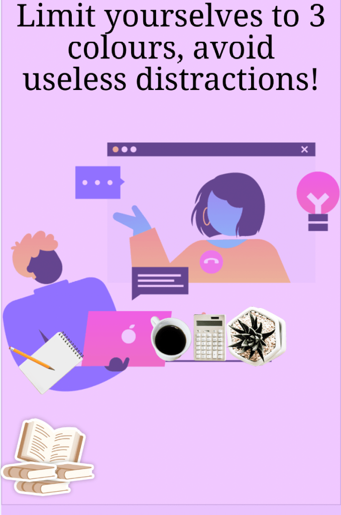
The key to a clear graphic is to limit yourself to three colours; otherwise, it can be very distracting. In graphic design, we look for simplicity that clarifies and makes connections. So let’s deduce from my graphic the design principle, which in this case, colours. From there, we can look at the image without difficulty and easily understand why the concept is so important: to understand a graphic clearly. Especially as a journalist, you want the public to know what your graphic is about; if they need to understand, they might gossip about their comprehension of the graphic, which could be fake news.
Accessible graphics for everyone’s enjoyment 🙂
Do you wear glasses? Do you have impaired vision? Even eye problems? Accessibility is here to help. As previously mentioned, accessibility is both mandatory by law and morally correct as it allows anyone to enjoy your content.
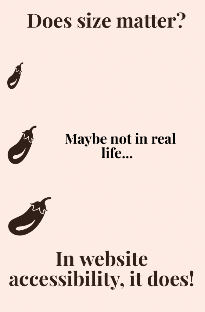
This graphic is both comedic and gives a valuable message. A graphic needs text suitable for a viewer’s eye to see clearly. In this graphic, the comparison is made between the size of an eggplant (with a particular reference) to understand the concept of sizing in accessibility.
Inclusive graphics so everyone understands
In society, many people wear glasses; others can only communicate in a specific language, like Braille, due to blindness, etc. Inclusivity is here to invite everyone to a conversation about the graphic.

As you can deduce from this graphic, the text conveys the message, and the four icons demonstrate the different people a journalist needs to remember to include. This graphic is more straightforward than the others but still explains the message effectively. That’s why simplicity is critical to a clear, accessible and inclusive graphic.
Have your say
By now, I’m sure you gossip lovers better understand how to create accessible, clear and inclusive graphics for everyone’s enjoyment. Of course, you wouldn’t want a soul to miss the vital tea to spill! So now go out and create visualizations that work, gossip readers!

Leave a comment