
Three people are spilling the tea by analyzing data together. (Image by Mikael Blomkvist via Pixabay)
Hey gossip readers, today’s tea is on data visualizations. By the end of this blog post, you will understand how charts and graphs can effectively communicate data. But first, why is this a useful visual method? Because not only is it easier to understand and compare data from previous years, but it’s also fun to create! I will help you analyze the importance and process of this method through my story on students’ confidence to be employed in their chosen field within a year of graduation.
Data analysis process
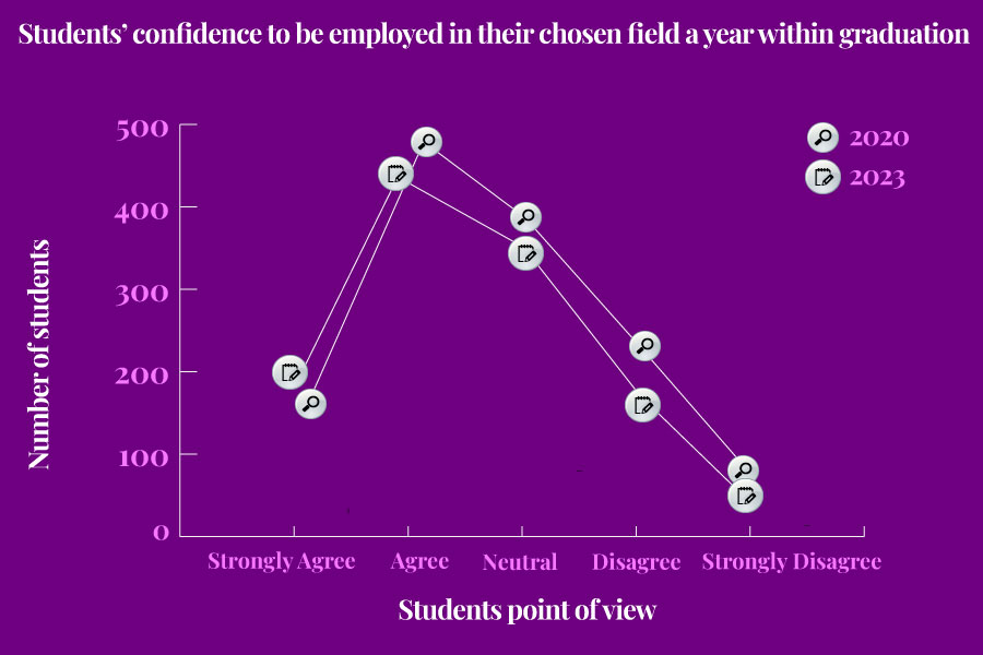
As gossip lovers, we love to analyze stories; data analysis is the same way, as we analyze data to tell a story by comparing two sets of data. So how do you know what tea’s most crucial to spill? The first step is to create a copy of the Megapolis datasets available from this year and past Megapolls. Afterwards, you want to use google sheets and create a pivot table to analyze data. From there, go to rows and values to select the question/topic’s data you want to compare. You typically want to compare interesting trends or significant differences in a story. For example, my story compares students’ confidence to be employed in their chosen field within a year of graduation between 2020 and 2023. It shows if the pandemic significantly changed how students feel. Now you can find a juicy story to analyze!
Creating charts/graphs process
Sometimes, we get so much information or tea that we get lost in stories. That’s why creating charts or graphs is a good idea to help your audience visually understand your tea! First, let’s make the graph pretty with Adobe Illustrator! Start by setting the size of your artboard to 900 pixels wide by 600 pixels high. From there, customize the visualization by adjusting fonts and colours, all while keeping in mind your branding guide and accessibility, as discussed in a previous blog post. Next, consider what message you’re trying to convey to decide what chart or graph to use. For example, I was stuck between using a bar graph to demonstrate how the numerical values relate to each other or a line graph. I chose a line graph as it is most effective for tracking change, reflecting my goal to demonstrate the difference between 2020 and 2023, aka pre and post-pandemic. So whether you are analyzing data or creating charts/graphs, make your visualizations clear for easier understanding. You don’t want people to spread false tea, after all!
Ensuring accessibility
Wouldn’t you be hurt if you were excluded from people’s conversations when they spill the tea? That’s why we communicate data in an accessible way, that way, everyone’s included. Our prof Sally attached a document on D2L regarding accessibility considerations suggesting the use of Adobe Color’s tool to test accessibility standards and to ensure labelling to make the information as straightforward as possible. Below is my story that followed data analysis and graph creation, all while ensuring accessibility.
The margin of error: First-year School of Journalism students surveyed 1170 Toronto Metropolitan University students between March 13 and March 21, 2023. Results for the full sample have a margin of error of plus or minus three percentage points 19 times out of 20; it may be larger for subgroups.
Conclusion
By now, I’m sure you gossip lovers understand how to communicate data through charts and graphs. It’s a nice and simple way to help visualize your story. After all, it’s only three steps: analyzing data, creating the chart and ensuring accessibility. So don’t let your tea go to waste, and go cover a story!

Leave a comment