Designing an infographic from datasets
Hey, gossip readers, today’s tea is on infographics. By the end of this blog post, you will understand how to design one from datasets. But first, why should you even make an infographic? It’s aesthetically satisfying and helps illustrate data, charts and graphs in one design! Keep reading to learn the tea on how infographics work!
Tips and tricks
As gossip lovers, we want to ensure the tea is accessible to others to hear or, in this case, see. For this, ensure your colours meet the accessibility guidelines! You also want to include charts, a conclusion, and a source list. After all, you wouldn’t want someone else to take credit for your work, would you? So don’t do that to someone else! Various free software exist to create charts or infographics, such as Infogram, Piktochart, Venngage, Flourish, Canva, and more. Feel free to explore them and choose whichever suits you best!
Analysis
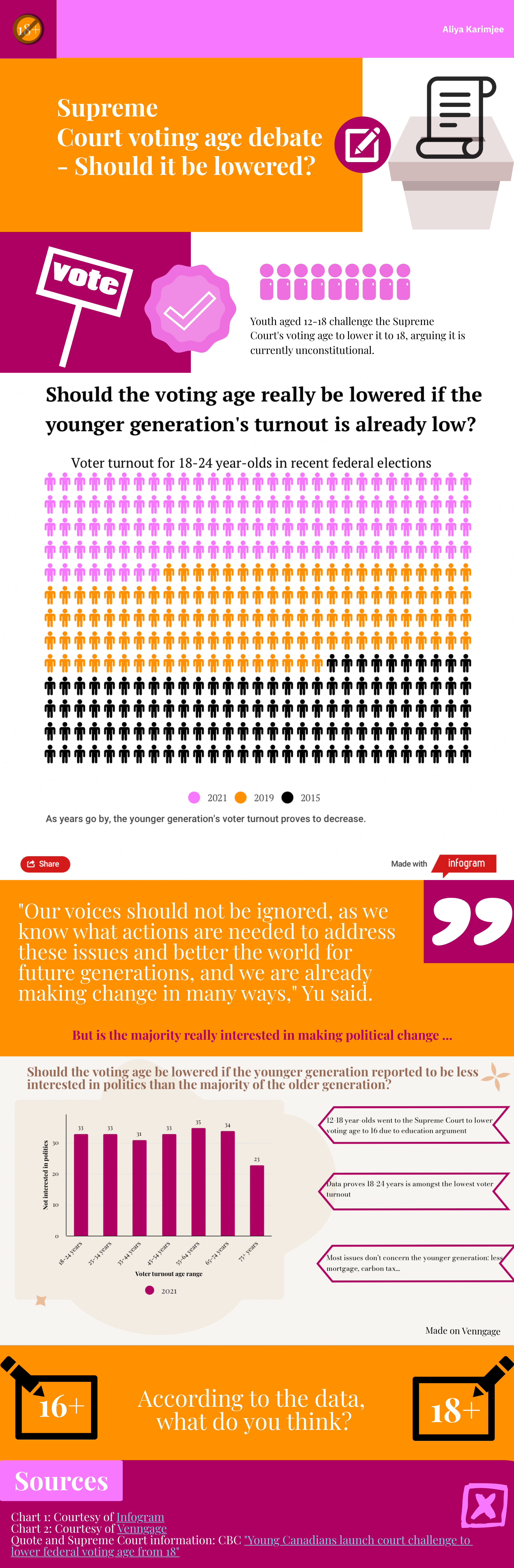
One of the juiciest pieces of political news I heard is the debate over the voting age. Some say it should be lowered as it’s unconstitutional, and others say politics shouldn’t involve youth. I took the liberty to investigate this tea with the help of datasets. I learnt that the younger generation had little turnout in the 2021 Canadian federal election. For my infographic below, I used Infogram and Venngage for the charts and Piktochart for the infographic itself!
Conclusion
By now, I’m sure you gossip lovers can use my tips and tricks and inspire yourselves from my example to create your infographic with the most recent juicy news! So don’t waste time and spill the tea as soon as possible!

Leave a comment